Here’s a handy statistic that’s worth remembering: over 60% of people accept or reject new products based on color, and that’s a figure you can think about when you consider the link between colors and products—like, for instance, whenever you think of Coca-Cola, you’ll likely think of red, or McDonald’s with the arches in yellow, or Starbucks with its signature green. It’s no accident that colors and top brands have such a strong relationship, and a big part of design is knowing how to pick the perfect colors, which—by the way—isn’t just about aesthetics but about giving your brand a personality and values, and designers use color schemes both to evoke emotions and to make a lasting impression on users, and customers. One of the techniques designers use to find the best colors for their brands is something called the triadic color scheme—and you can see how to use it to create visuals that make a big impact.
What Is a Triadic Color Scheme?
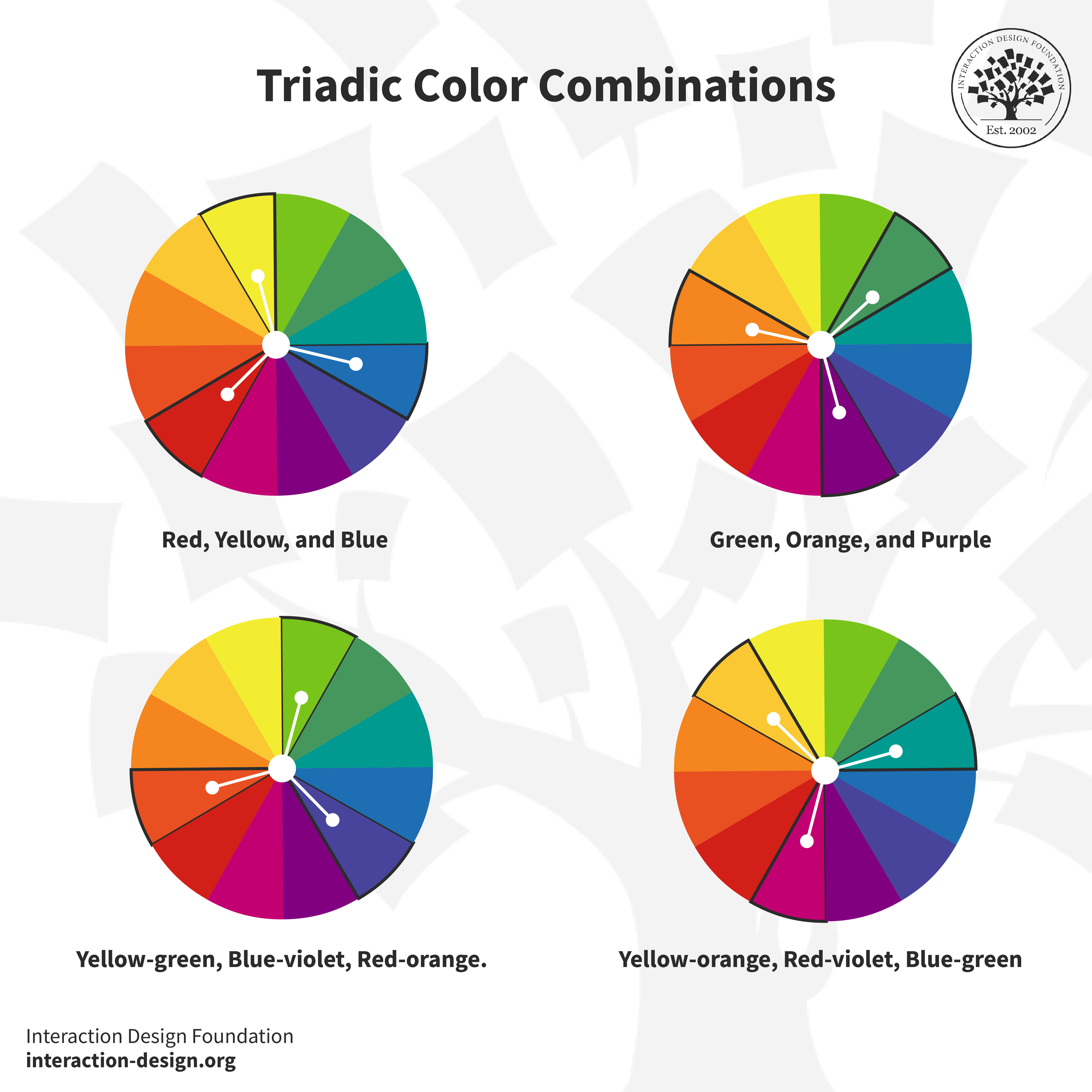
As you can likely tell from the “tri” in “triadic,” there are three colors involved for any one selection you make—but there’s a specific way to get them, and they’re not ones that sit next to or right across from each other. Triadic colors sit at equal distances from the color wheel—that handy tool that artists and designers have referred to since Sir Isaac Newton invented his color wheel in 1666—so your three triadic colors are equidistant and make an equilateral triangle if you draw joining lines between them.
© Interaction Design Foundation, CC BY-SA 4.0
There’s a nice and easy example of what makes a triadic color scheme—and it’s our three primary colors, red, blue, and yellow—and an important point to remember is that triadic colors make a vibrant color palette. That’s because it means separating each color, no matter what the specific hues are, so as you look around the color wheel, you can land on triadic color combinations such as green, orange, and purple. And if you go into the “mixes” between these hues, you’ll get fascinating and alluring triadic combos of yellow-green, blue-violet, and red-orange, and yellow-orange, red-violet, and blue-green.
© Interaction Design Foundation, CC BY-SA 4.0
Thanks to the many, many online resources that are available, it’s pretty much safe to say that anyone who can dabble or have a go at it can make impressive visuals, even if they don’t have much in the way of artistic talent. Still, with that said, you need to go beyond the area of picking your favorites if you’re going to pick the perfect color combination—and that’s where you’ll need to dive into color theory and design principles so you get things right.
So, what is color theory? It’s the study of how colors work together—especially because some work really well and some really don’t work well—and how the colors you can pick will affect emotions and perceptions whenever people look at the designs you set in front of them. That’s why it’s so critical for you to understand how colors work together if you’re going to reinforce your brand, make your website easy to read and navigate, and—above all—make it visually appealing.
Deep dive into color in this video by Arielle Eckstut, Author of What Is Color? 50 Questions and Answers on the Science of Color.
How to Select a Triadic Color Scheme for Your Design
You’re going to know just how powerful color is in design no matter if you’re a designer who’s starting out or if you’ve been one for a long time—and, from that, you’ll know how vital it is to pick a color scheme that works (as in, makes the best impact on users and keeps anyone from getting confused). Sure, it’s more work to choose a triadic color scheme than it is to use pretty much any other color scheme, but—the good news—it can be far easier to pick a good or great one when you’ve got some handy tips you can count on.
.jpg)
© Interaction Design Foundation, CC BY-SA 4.0
1. Understand the Color Wheel
That color wheel you encountered earlier, it’s pretty important for designers—along with artists—and you’ve got to understand the simple color wheel triads if you’re going to create beautiful color combinations. Aside from that, you’re also going to need to understand primary, secondary, and tertiary color placement on the wheel so you can have a good feel—or reference point—of what is what and what is where and then be able to take things from there.
2. Align Your Color Choices with the Purpose of Your Project
Now you’ve got to look at getting your color choices in line with your end goal, and it’s here where you’ll need to ask a few questions—for example, what feelings do you want to bring out of your users—or viewers—from your triadic color palette? This will need to be in line with what your product or service offers them, like food, travel, banking, healthcare—the list goes on (and can be as long and varied as the range of industries that exist). To be sure, some colors suit some industries or product or service types better than others, but one of the biggest advantages here is that when you’ve got your end goal in mind—as in, what your brand’s message is—it becomes so easy to choose the dominant color.
It’s here where it’s great to check out some examples of how colors suit businesses and industries, and if you want to—for instance—create a fintech app, then you can pick blue as your primary color (or dominant color). Take a look at fintech brands out there and you’ll notice how blue features a great deal, and that’s because blue represents power and trust—key ingredients whenever people are engaging with an organization that handles their money.
So, that’s one color, but there are still two others to address for our triadic combination here, and those other two colors you can bring on board to act as accents or accent colors, and you can bring the saturation level in these colors down so they’re more muted—something that helps make a more cohesive blend with your dominant color.
Just begin with what the purpose of your palette is—be it energy you want to invoke, calmness, or creativity—and take it from there. For example, take the blue you’re thinking about for your fintech app and see which other two colors are equidistant from it on the color wheel; whatever’s appropriate for your brand—and its brand guidelines should have much to say about whether it’s a “traditional” banking color scheme or something with more vibrant verve, maybe to suit a younger target audience. Then, taking things from there, you’d proceed with a trio of colors that evokes the desired feelings.
3. Understand the Emotions Behind Colors
Bold, bright colors make a strong impact, by their very nature, while pastel shades create a calm, unified look—so, as long as you understand the emotions of colors and what your brand is about and how users—and customers—are bound to react to your color choices (a factor that will depend on their culture, too), it can help you create a palette that’s nice and cohesive to your brand.
4. Test the Color Harmony
Once you’ve picked out the three colors, you’re going to have to test them out to see how they work together—and that’s because some combinations might clash or be too much and spell visual overload for whoever sees the design you make—and see if they’ve got enough contrast and that they don't clash. The best way for you to test the triadic color harmony is to create swatches or use an online color tool—and you can find online color tools that can help you explore and visualize different triadic combinations fast, and you’ve got some of the best tools that are available online to check out, such as Adobe Color, Coolors, and Hubspot Color Palette Generator.
5. Test Color Contrast
Another vital thing is accessible design, and while contrast has come up before, you’ve got to make sure that your color choices provide adequate contrast for reading on screen—and it’s something that you’ll need to do so your design complies with legislation for users with disabilities in most countries. For example, most shades of yellow and lighter shades of other colors don’t provide adequate color contrast on a white background—it’s extremely hard to make out what’s going on in a design even for users who don’t have visual disabilities. In any case, go and read the Web Content Accessibility Guidelines for advice and tools for measuring contrast.
Watch this video to learn how to simplify your color palettes.
A Step-by-Step Guide to Creating a Triadic Color Scheme
.jpg)
© Interaction Design Foundation, CC BY-SA 4.0
1. Set the Context
Context is fundamental, foundational, and the primary thing you’ve got to decide on before you think about any primary colors, for example—so, what message do you want to convey? What emotions do you want to evoke from users and potential customers who visit the website you’ll make, for example? What mood do you want your triadic color combination to set for anyone who arrives on the design? Different colors evoke different emotions and associations, and red—for instance—can signify passion or danger much of the time. Another thing that will be a deciding factor is the associations, and users in Eastern cultures will more likely view red with connotations of good fortune, for instance, than those in Western cultures will. In any case, your triad colors have got to both align with the purpose and message of your project and mirror what feelings you want to bring out from the users who arrive on the site.
2. Select Lead Color and Identify Complementary Colors
The weightiest decision when you want to form a triadic color combination is to pick your dominant color, and that’s because your lead color is going to set both the tone and the mood of your project—say, our banking website as an example. Besides, the other two colors depend on it and need to work best with it so all three work with each other to maximum effect. So, with all that said, what kind of factors do you need to consider whenever you’re choosing the dominant color?
Emotional impact is the first major thing, since each color has different emotional associations, which are cultural as well as down to the individual—where, say, red may evoke passion, excitement, or hunger, while blue may induce the trust and calmness a bank would need—and you’ve got to choose a lead color that’s in line with the desired emotional impact on your audience for your design.
Brand identity is the other heavy consideration, and if you're selecting a triadic scheme for a brand, the dominant color has got to be in line with the brand’s existing identity—and that’s vital for brand recognition—and so it’ll be something that’s already decided for you in the brand guidelines (or “from corporate”). However, if you’re coming on board to a fresh startup that’s just coming into being, you’ll likely have more input or leeway to decide on a fresh look.
3. Decide Between Primary and Secondary Colors
One more thing for when you’re deciding on what the colors will be—depending on what your design objectives are, you can go for a triad of primary or secondary colors. A primary triadic color scheme will create a vibrant and lively design—something that can jump out more at users—while a secondary triadic color scheme will give you a more subdued and neutral color palette to work with—a better fit for brands with a different kind of message for their users and customers.
4. Check Visual Balance and Harmony
Now that you’ve got the colors picked out (and congratulations if the scheme turns out to be one that works as well as you intend it to!), you’re going to have to adjust the saturation or brightness so that you end up with a visually pleasing combination. You can experiment with different shades and tones—but the key here is "balance" and, in any case, your color choices in this step should be consistent with the message you want to get across to your viewers—or users and customers, to put it in user experience (UX) design terms.
5. Consider Proportion and Hierarchy
Decide on how you want to use the selected triad colors within your design—where the lead color tends to feature the most, while the two triadic colors act as accents or background colors—and you want to guide the user’s eye here, so create a good hierarchy in your design to do that with.
6. Follow the 60-30-10 Rule
The classic 60-30-10 rule is nice and simple—60% of your palette should be a dominant color, 30% should be the secondary color, and 10% should be an accent color—and it’s a time-tested rule for creating a balance and letting users move from one focal point to the next with comfort and ease.
7. Create Design Mockups
Before you commit fully to anything as a final design, you’ve got to try things out, so apply the triadic scheme you intend to use to design mockups or prototypes so that you can see how well it works. For one thing, it will help you determine whether the color scheme you’ve picked meets the objectives of your project; for another thing, it’ll save your sinking a great deal of time and effort (and money, by association) into something that doesn’t work as well as you had hoped at first.
8. Test for Accessibility
Remember to design for accessibility—it’s too vital a thing to overlook, no matter if you’re designing a website, an app, or marketing collateral—and whatever you’re working on, you’ll need to make color choices accessible. It’s so that the broadest possible audience can understand your design—and so that your design complies with legislation for users with disabilities—and you can use contrast-checking tools to make sure that text will be legible for users with disabilities such as color blindness.

Great Brand Examples That Use Triadic Color Schemes
There are a wealth of real-life triadic color scheme examples out there, and you can take inspiration from brands who have done it well, such as brands like Burger King, Mozilla Firefox, and Fanta—so it’s more than worth it to have a close look at a couple of examples.
1. Tide

© Procter & Gamble, Fair Use
The type of orange or red-orange that American laundry detergent brand Tide has as the dominant logo color represents both zest (or enthusiasm) and freshness—and that’s a suitable choice, since it gives a great sense of cleanliness and revitalization; just what customers are after when they’ve got laundry to do and want great quality. On both sides of the orangey-red band or circle there’s the complementary shade of yellow that sets things off in an effective way—and in terms of the meaning it conveys, it doesn’t just align with cleanliness and freshness but adds a sunny and cheerful aspect to the brand, too.
Then there’s the second complementary color, a type of blue outlined in white, which contrasts with the dominant orange-red and makes for a visually appealing combination that “pops” iconically, as a much-loved brand logo should. But there’s something more than just the aesthetics involved here—remember how blue stands for trustworthiness and reliability, and it’s through this that Tide’s consumers—as well as store-goers and anyone who sees the logo—can feel all the more assured that their laundry is going to get nice and clean and bright when they use Tide products.
2. Airtable
© Wikipedia, Fair Use
Airtable is a project management software that uses a triadic color scheme, and the logo that it’s got has different triadic colors and tints of the three primary colors—red, yellow, and blue—and you can see how they work together to make up a highly effective look in the logo. Blue is dominant here and a prominent part of the logo, and that’s a fitting thing because blue—as well as its association with reliability in, say, banking—has got a common association with the tech industry.
For the complementary colors, there are a shade of yellow that not only works well with the blue as a contrasting accent to it but carries with it a nice touch of energy and creativity too, and last—but not least—the touch of red, which plays well with the other two colors, pointing forward with energy and creativity in its symbolism while it makes a neat and eye-catching and memorable addition to complete the trio.
Visual skills are paramount for effectively working with color, so learn more about how important they are—and why—in this video.
How are Triadic Color Schemes Used in Various Industries?
1. Photography

© Pexels, Fair Use
Photographers use triadic color schemes to capture visually striking pictures—something that can help to emphasize the composition and subject of a photograph—and from how photographers use colors equally spaced on the color wheel, they create a natural balance within the frame. For instance, triadic schemes work well in the extreme in landscape photography of colorful markets, street festivals, or gardens in full bloom—check out these in magazines and online; they can be stunning.
Then there’s fashion photography, where photographers use the triadic scheme when they’re shooting portraits—and it’s an approach that extends to clothing, makeup, or backgrounds, and makes for a look that’s visually harmonious. Likewise, in product photography, a triadic color scheme helps capture the essence of the product and bring it that much closer to viewers so they can sense its qualities and imagine how it can benefit them all the better.
2. Movies

© Pinterest, Fair Use
On the surface of it—and since we’re looking at designs as more or less “static” things here—you might not think that triadic color combinations could feature in feature films, but, yes, triadic turns up in movies, too. Ang Lee's The Incredible Hulk provides a superb example to capture this (although you’d be far less likely to capture the Hulk if you tried to), and the film’s approach to visual storytelling is distinctive and powerful.
In the still above, you’ll find our main character the Hulk—with his signature green to represent his monstrous and uncontrollable alter ego—and notice how his dominant hue works so well with the purple and orange as the other two colors in this triadic color scheme, a nifty effect.
3. Web design

© Nick, Fair use
Nickelodeon’s web design pays attention to its target audience, not least since its UI color palette is neat proof of how the brand keeps in mind children and families, and there’s an iconic way to how Nick incorporates their triadic color scheme—the dominant color of orange, and Nick’s signature bright orange dominates their website. Orange is a great choice because it represents the brand’s lively, energetic, and playful energy, but another nifty point about their color choice is how they capture the users’ attention right away with it, and so prompt excitement and fun through that unique “splat” effect.
Then, the secondary colors of green and blue work as neat complements—colors that people commonly associate with Nickelodeon’s iconic slime and water-themed branding, and it’s a triadic scheme that visually appeals to children and helps get across the sense of entertainment and adventure Nickelodeon is known—and loved—for.
The Take Away
Whenever you want to go for a triadic color scheme, you’ll need to understand color theory, practice, and use creativity to great effect if you’re to make the best use of triadic color combinations and schemes. Along with that, know the purpose of your design, your brand’s message (and brand guidelines), and what feelings you want to bring out from the people who see your design. You can create visually appealing and harmonious designs using a triadic color scheme and have fun on the way, even though it can sometimes take a great deal of thought and effort.
Sure, there’s no one-size-fits-all approach and, to be sure, you’ll need to experiment to find the perfect color combination for your project, but find a triadic color scheme that speaks best to your brand’s target audience, and even beyond, and you may just arrive at an iconic color scheme that becomes ingrained in the public consciousness for many years to come.
References and Where to Learn More
Learn how to design a UI Color Palette.
Learn more about color theory in this topic.
Read this blog post to understand the relationship between Colors and Emotions.
Deep dive into color with this course, User Experience: The Beginner’s Guide.